BABESKIN
Client
BABESKIN Cosmetic co.
Date
JUN 2023
Role
Cosmetic co.
Website
www.babeskine.com
PROJECT OVERVIEW
BABESKIN
THE BIRTH OF A STAR
Babeskin establishes its positioning in the market as a brand that aims to offer its customers the right solutions in skin care with its innovative and innovative perspective. In a market where the discourses in the skin care industry and the solutions offered by brands have become commonplace, Babeskin was born from a story that set out to offer quality and innovative solutions.
Details /
Type
New Brand
Category
Cosmetic
Services
Art Direction/ Brand Identity / Verbal Identity/ 3D Modeling
/03
VISUAL DIRECTION
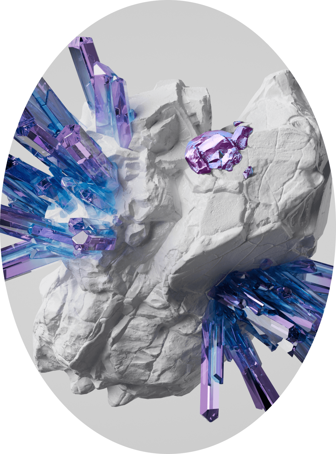
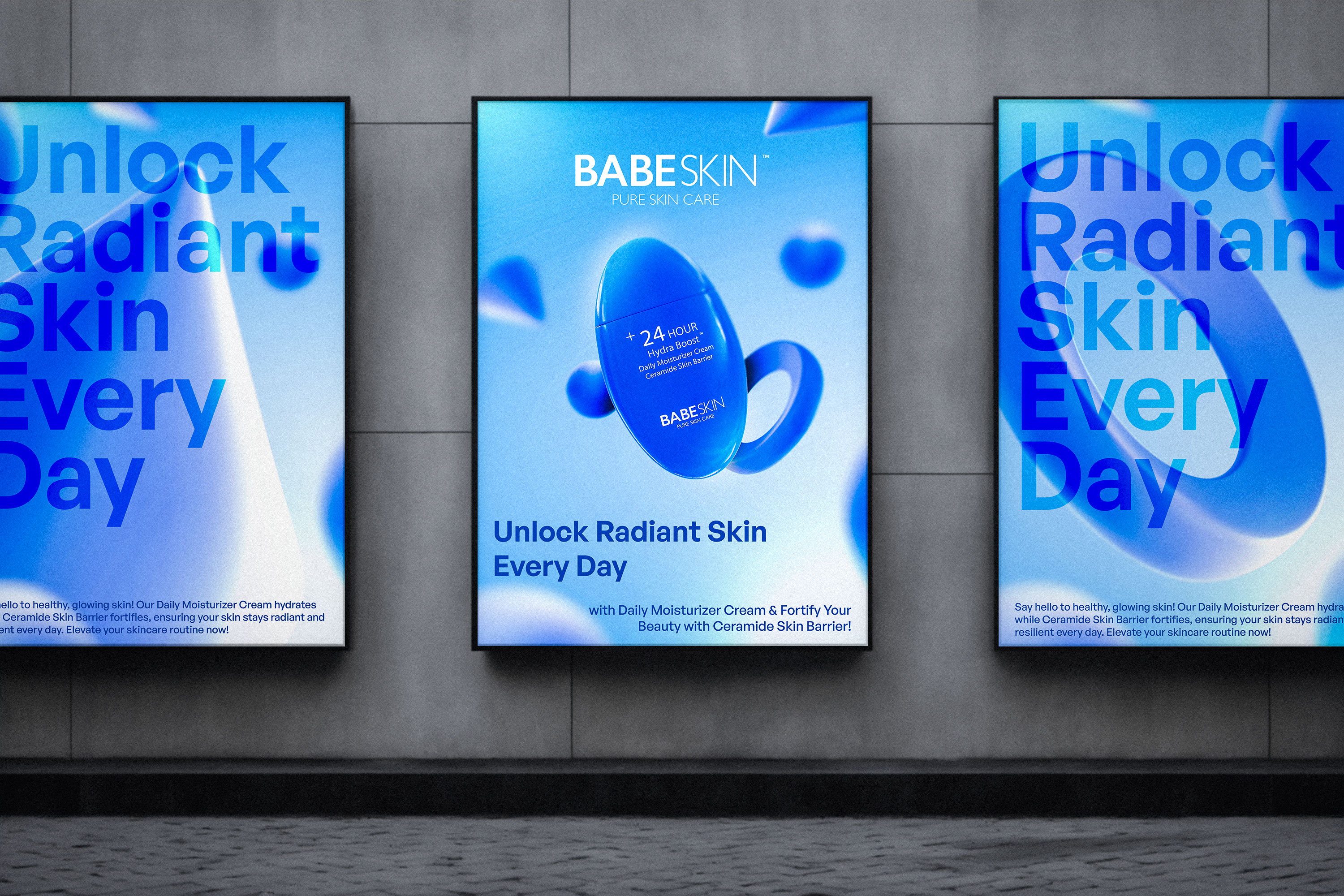
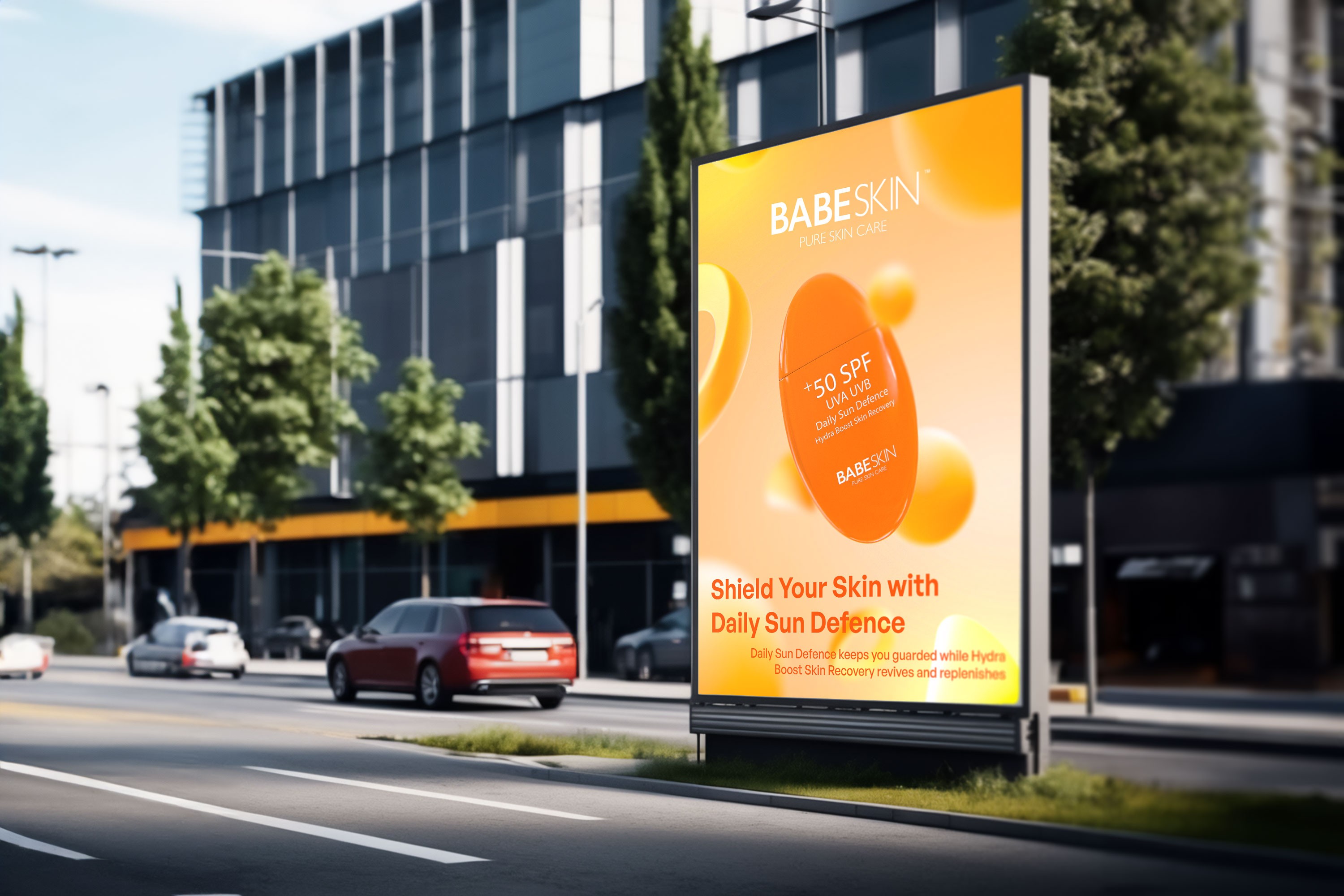
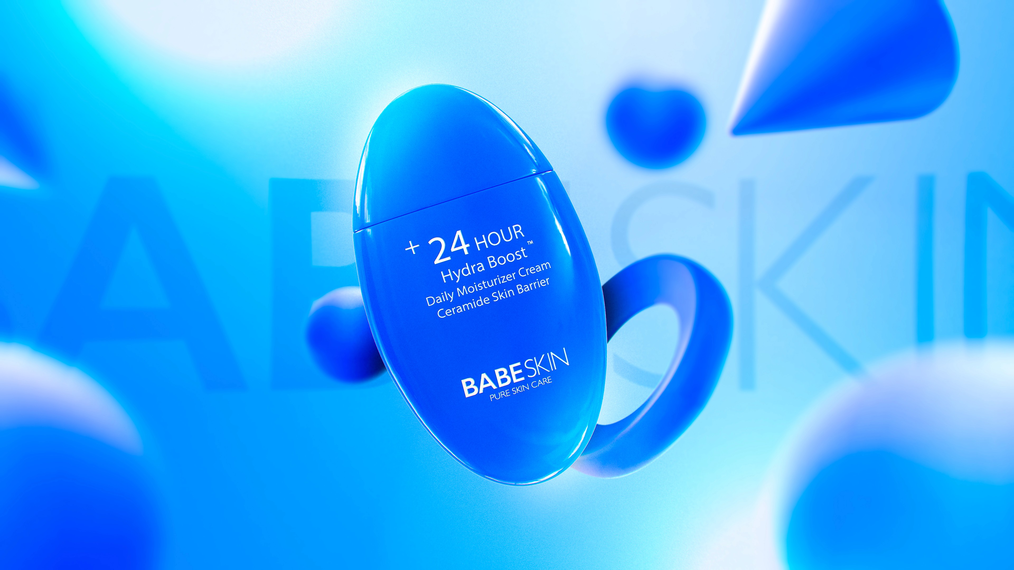
The visual direction of the Babeskin brand focuses on the themes of simplicity, elegance and modernity. While the brand's logo offers a polite and feminine look, the color palette provides a harmonious and pleasant appearance with pastel tones. Product designs are also designed with a minimalist approach and pastel tones are used. This design language creates the impression of a skin care brand that aims to offer the right solutions, in harmony with the brand's innovative and modern perspective.
/04
EMPATHY MAP
Babeskin is in a sector that grows every day and maintains the balance of supply and demand.
It would be a correct statement to say that global brands have entered the Turkish market and that there are Turkish brands entering the market with sales-oriented strategies every day and that it has become monotonous.
Babeskin, in line with extensive market and competitor analysis, has decided that differentiation and separation is the right way for the consumer and the brands in the market.
It has determined as the top priority plan to bring together the world vision with the spirit of Babeskin by receiving the most professional support in matters such as production, raw materials, business development and brand positioning in the R&D studies.
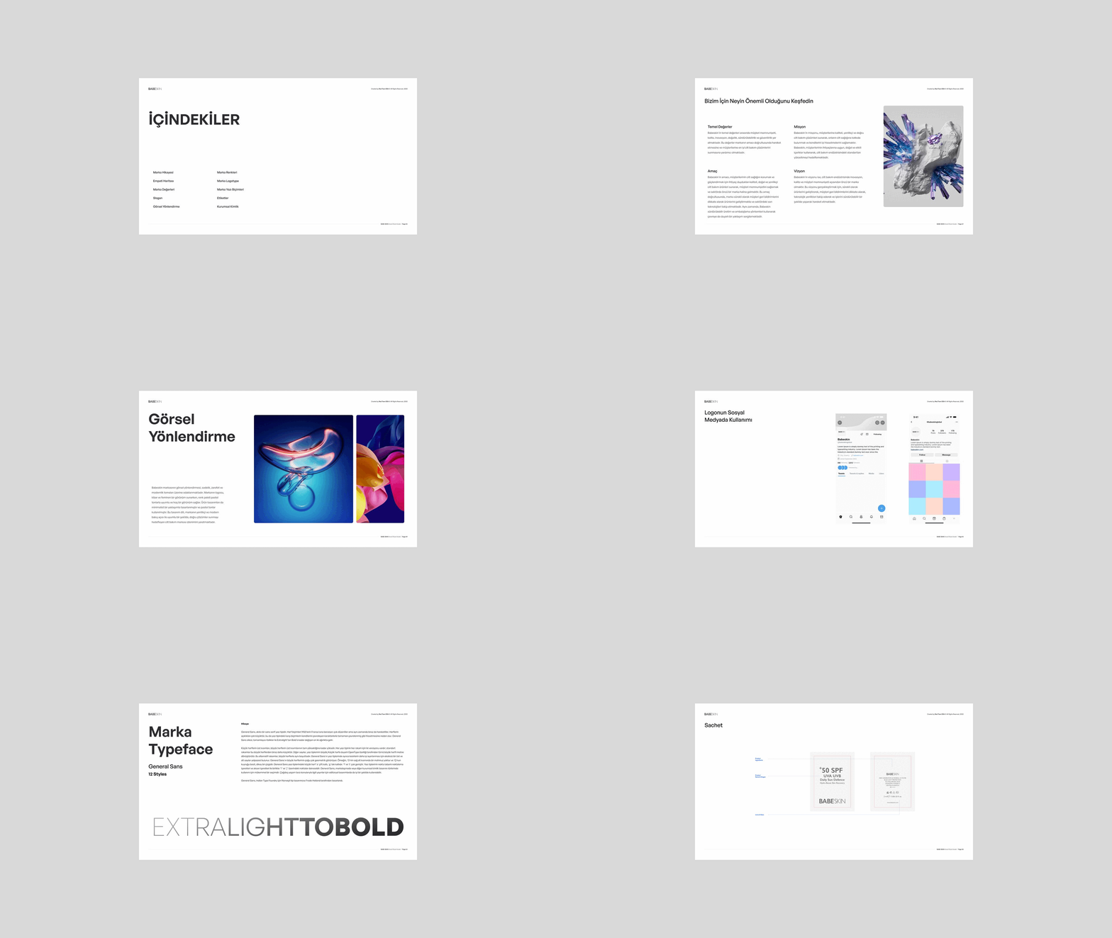
Discover What's Important to Us
/05
LOGO
Enhancing Brand Identity and Recognition
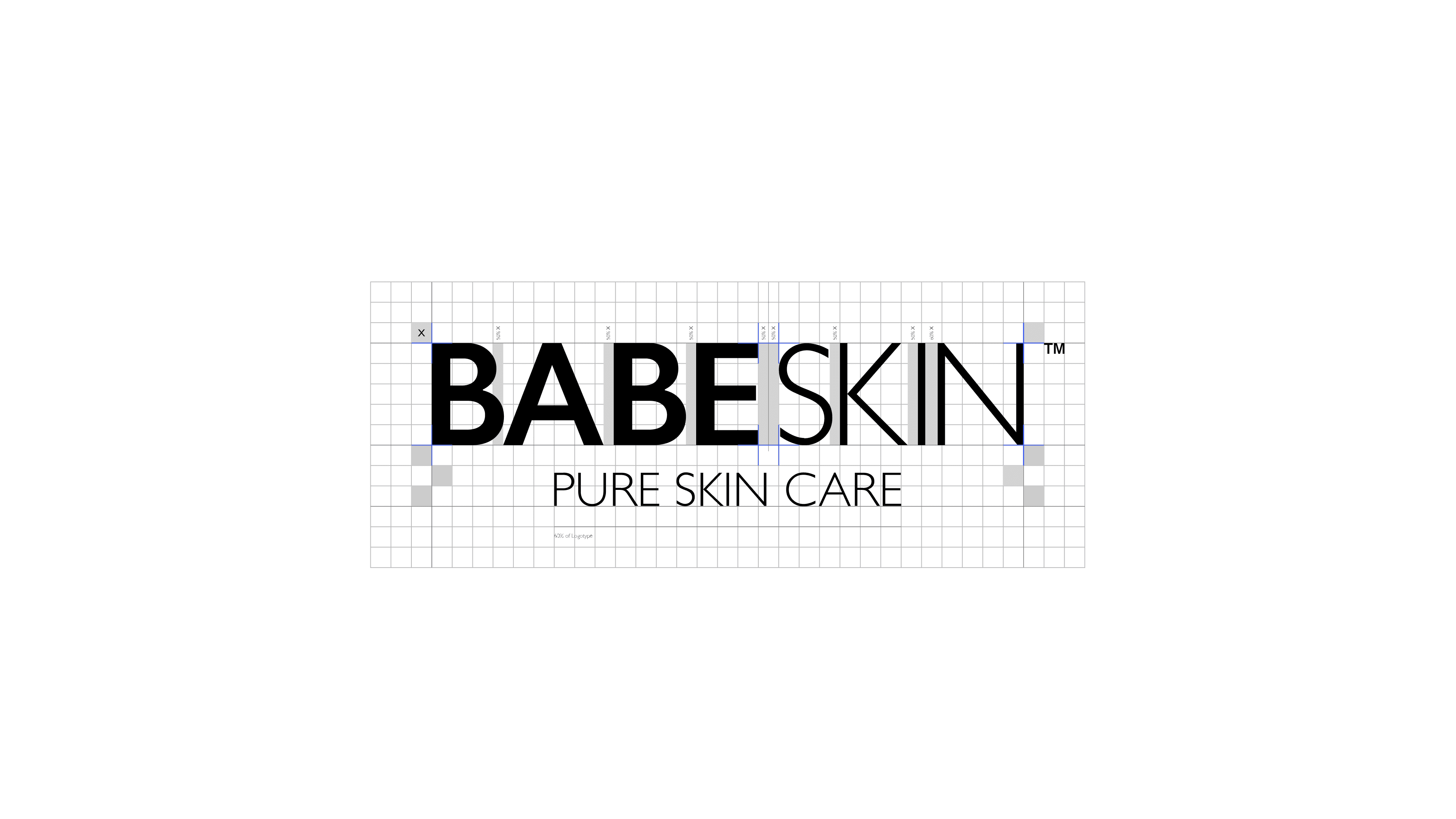
A logotype, integral to a brand's logo, is a font designed specifically for representing the brand's name. Its primary benefit lies in bolstering brand recognizability. A successful logotype is characterized by simplicity and clarity, ensuring easy brand recognition. Moreover, as a distinct element of the logo, it allows for customization while maintaining brand consistency. Consistency in brand identity, encompassing visual and auditory aspects, is vital for credibility and recognizability. Thus, the logotype plays a crucial role in upholding brand identity consistency.
/06
COLOURS OF BABE
Psychology of color in branding
You may have heard that color can affect mood and even change the way people view a product. It is the brand's corporate colors that primarily determine the perception and distinction between brands and products.
#F4F4F4
RGB 244, 244, 244
CMYK 0, 0, 0, 4
#0E0E0E
RGB 14, 14, 14
CMYK 0, 0, 0, 95
Accent
Babeskin, on the other hand, has created its own world with the vision it has put forward and the point of contact where it wants to position the brand, and has created a color palette that always pushes the boundaries of that world and will support the feeling of renewal and difference in the consumer.
#E0AFA0
RGB 224, 175, 160
CMYK 0, 22, 29, 12
#F72585
RGB 247, 37, 133
CMYK 0, 85, 46, 3
#7209B7
RGB 114, 9, 183
CMYK 38, 95, 0, 28
#3A0CA3
RGB 58, 12, 163
CMYK 64, 93, 0, 36
#4361EE
RGB 67, 97, 238
CMYK 72, 59, 0, 7
#4CC9F0
RGB 76, 201, 240
CMYK 68, 16, 0, 6
